Update 2.02.00 - New fonts, updated appearance
Font options are here! Along with the original font, there's now a new font with similar metrics to the original but with curves instead of blocky corners. There's also an updated version of the original font with some tweaks and more consistency, but the unmodified original font is still selectable if you prefer it. That makes a total of three fonts, with the potential for more being added later.
This update also makes a number of changes to the game's overall appearance, some slight and some significant. A full list of the changes made can be found below.
New fonts
- An option has been added to change the font in use. It can be found at (Settings > Appearance > Font).
- A new font, called "curve font", has been added to the game as an option.
- A modified version of the original font, listed as "block font (new)", has been added to the game.
- A new option allows you to choose whether or not you want to always use a scaled higher resolution font.
- Each font has a high resolution version, which is scaled up or down to match the game's current resolution settings. At lower game resolutions, though, smaller custom versions of the fonts are used instead, unless this option is enabled.
- Fonts now scale dynamically rather than using hard-coded scaling intervals.
- Kerning is now only done between letters, with punctuation always being excluded. Previously, certain punctionation like / was subject to the built-in auto font kerning, but things like URLs look better without it.
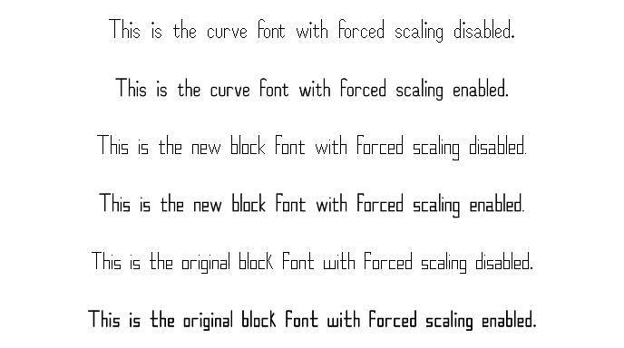
A comparison of the three fonts with forced scaling on and off at 1080p:
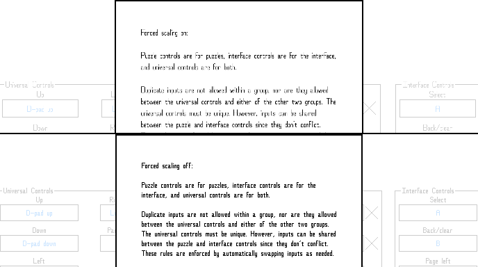
Forced scaling doesn't work as well at low resolutions:
Puzzle hints changes
- Puzzle hints are now evenly spaced for both rows and columns.
- Puzzle hints are now automatically sized to closely match the size of the puzzle squares.
- Puzzle hint highlights are now consistently sized to match the puzzle squares.
Other appearance changes
- Improved puzzle grid sizing and placement.
- Improved puzzle select button sizing and placement.
- The button size is now more consistent between resolutions, and the buttons are now centered vertically in the screen/window.
- Improved overall UI scaling. Specifically, UI elements are now always scaled relative to the size of the text, providing a more consistent experience across resolutions.
- Improved tutorial page UI element sizing and placement.
- Moved optional extra puzzle column and row info to be above the "Fill placeholders" button in the lower left corner of the puzzle screen, leaving more room for the puzzle itself.
- Changed the loading screen.
- A small image of the frog from my logo now spins in the lower right corner.
- Instead of a progress bar, the game's title text gradually fills in with full color as loading progresses.
- Moved the checkmarks that optionally mark which puzzles have been solved to the upper right corner of the puzzle select buttons. This leaves more room for the titles of the puzzles.
- Added a third type of main menu button arrangement to better match ultra-tall resolutions, which almost certainly no one uses, but whatever.
- Changed how the size of toggle and color swatch boxes is determined for better consistency.
- Changed toggle and color swatch boxes to no longer move back and forth when the containing button is selected and hovering.
- Fixed various issues with overlapping or cut off UI elements at various resolutions.
- Fixed the "User puzzles" text on the main menu exceeding the boundaries of the button at certain resolutions.
- Fixed sound effect, playlist, and theme editor buttons not downsizing correctly at certain resolutions when they needed to.
- Changed the game title and icon to be more consistent across both the title screen in-game and in various other places, such as Steam store and library images.
Settings changes
- Changed "Options" to "Settings" for consistency.
- Rearranged display, appearance, and puzzle appearance settings.
- Added a new sub-menu of "Other appearance options" to make room for the new font settings, with a number of the appearance options having been moved there.
- Added a link to puzzle appearance settings to the appearance menu. It can now be accessed both by (Settings > Puzzle > Puzzle appearance) and (Settings > Appearance > Puzzle appearance).
- Changed other five-line related options to be greyed out when five lines themselves are disabled.
Other changes
- Removed the fade in effect of the intro HopefulToad logo screen, and changed the fade out effect to be skipped when the intro screen is skipped to make getting to the main menu faster.
- Removed unused lines of text from the game.
- Replaced references to "the below example" in one of the tutorials with "this example," since the examples in question are actually above the text, not below it.
- Changed some info pop-up text for clarity and consistency.
- Changed text in dialogs and in tutorials to auto-wrap instead of using hard-coded newline locations.
- Ensured that the most recently selected puzzle button will always be selected upon re-entering a puzzle select scenario, no matter what settings have been changed mid-puzzle.
- Fixed an issue where, at the main menu at certain resolutions, if the settings menu was closed via mouse and the mouse wasn't moved, clicking wouldn't change the currently selected main menu button to the one the mouse was hovering over.
Files
Get Nonozle
Nonozle
A number logic puzzle game.
| Status | Released |
| Author | HopefulToad |
| Genre | Puzzle |
| Tags | 2D, Family Friendly, Minimalist, Pixel Art, Relaxing, Singleplayer |
| Languages | English |
| Accessibility | Color-blind friendly, Configurable controls, High-contrast |
More posts
- 3.02.03 patch notesApr 07, 2025
- 4.01.25 patch notesApr 01, 2025
- 3.02.02 patch notesMar 19, 2025
- 3.02.01 patch notesOct 28, 2024
- Minor update (no version number change)Oct 28, 2024
- Update 3.02.00 - Color theme overhaulJul 05, 2024
- 3.01.00 - Counting passesDec 15, 2023
- 3.00.02 patch notesNov 29, 2023
- 3.00.01 patch notesNov 21, 2023
- Update 3.00.00 - Puzzle exporting and moreNov 21, 2023

Leave a comment
Log in with itch.io to leave a comment.