Update 3.02.00 - Color theme overhaul
Nonozle's color theme system and theme editor have been totally reworked.
Prior to this update, the game had three built-in themes and a hard limit of five custom themes that couldn't be renamed or shared. With 3.02.00, themes are now like puzzle packs: you can rename them, sign and export them, and add as many as you want.*
The five existing custom themes will be imported into the new system on first startup. But the theme you had selected as your current theme prior to 3.02.00 will not be recalled because the method of saving and recalling which theme is the current one has been changed.
Twelve new included themes
This update includes twelve new built-in themes.
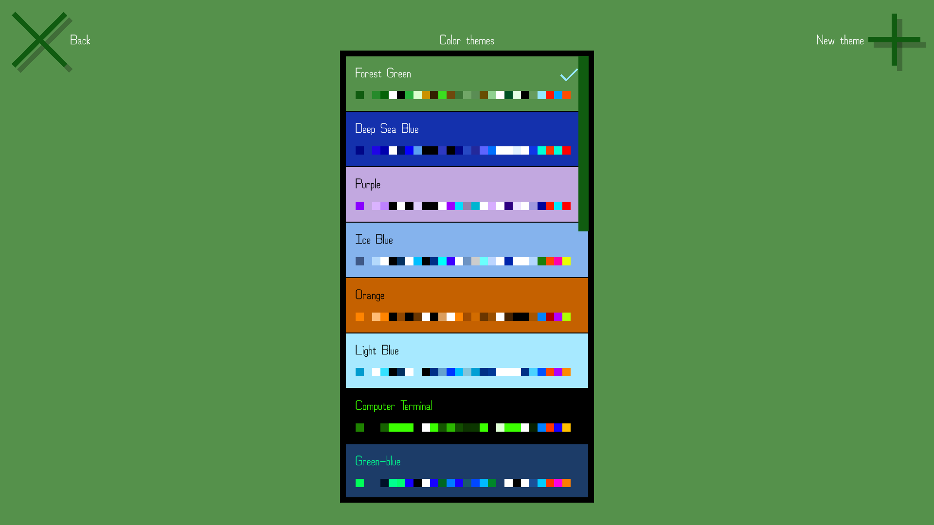
Forest Green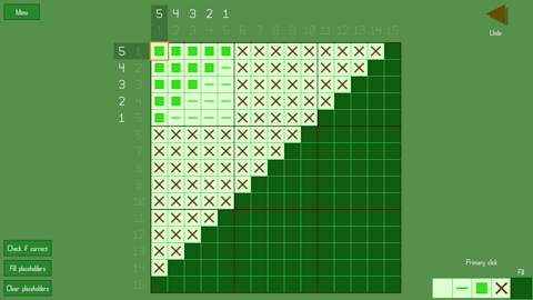
Deep Sea Blue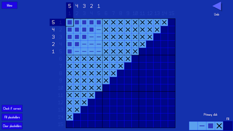
Purple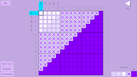
Ice Blue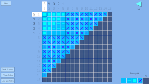
Orange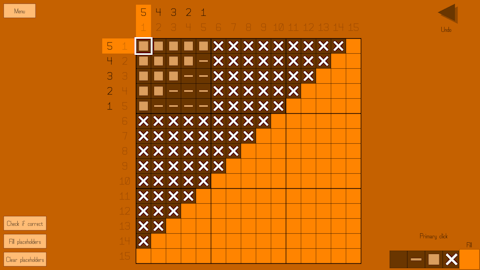
Light Blue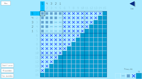
Computer Terminal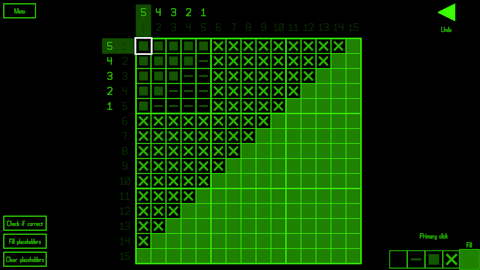
Green-blue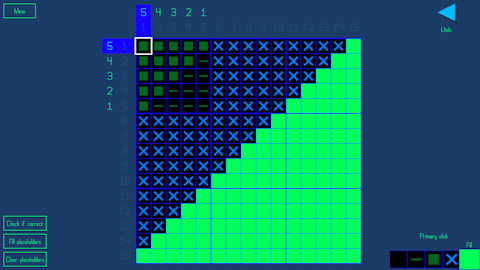
Rose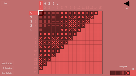
Print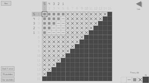
Black and White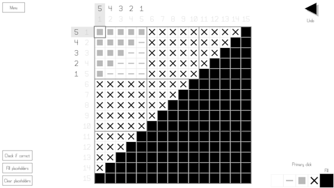
White and Black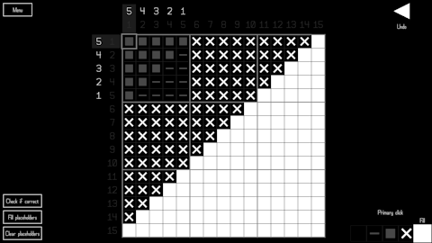
Additionally, the three original built-in themes (Light, Grey, and Dark) are still included but have been somewhat reworked.
Primary color differences
Prior to this update, you could choose from multiple different primary colors for the built-in themes Light, Grey, and Dark. But because of how the theme system has been reimagined, this is no longer the case. Each theme has just one primary color associated with it, and directly changing the primary color of a built-in theme is not possible. You can copy the theme to create your own version of it and thus change the primary color that way, but you would also likely want to change a few of the other colors that are often related to the primary color, such as the puzzle select button background and hint highlight colors, because those are now settable color types of their own instead of directly using and modifying the primary color. So the process is a bit more involved now.
Theme select
Instead of using a MultiOptionSelector to choose the current theme, there's a new screen (with a layout like that of the user puzzle pack lists) where you can scroll through the list of themes. From here you can pick the current theme, create a new theme or copy an existing theme, edit your own themes, and delete themes (except built-in ones). The items in the list use their respective theme's color instead of the current theme's colors as a quick preview, and all colors in the theme are shown in a row of color swatches.
Theme editor
The theme editor has been completely reworked. Instead of showing a list of the colors, color types are accessed by using a drop list. A preview of how the current theme looks is shown, and the screen being shown in the preview automatically changes to make sure that the currently selected color type is visible. You can see in real time how every color looks as you change it.
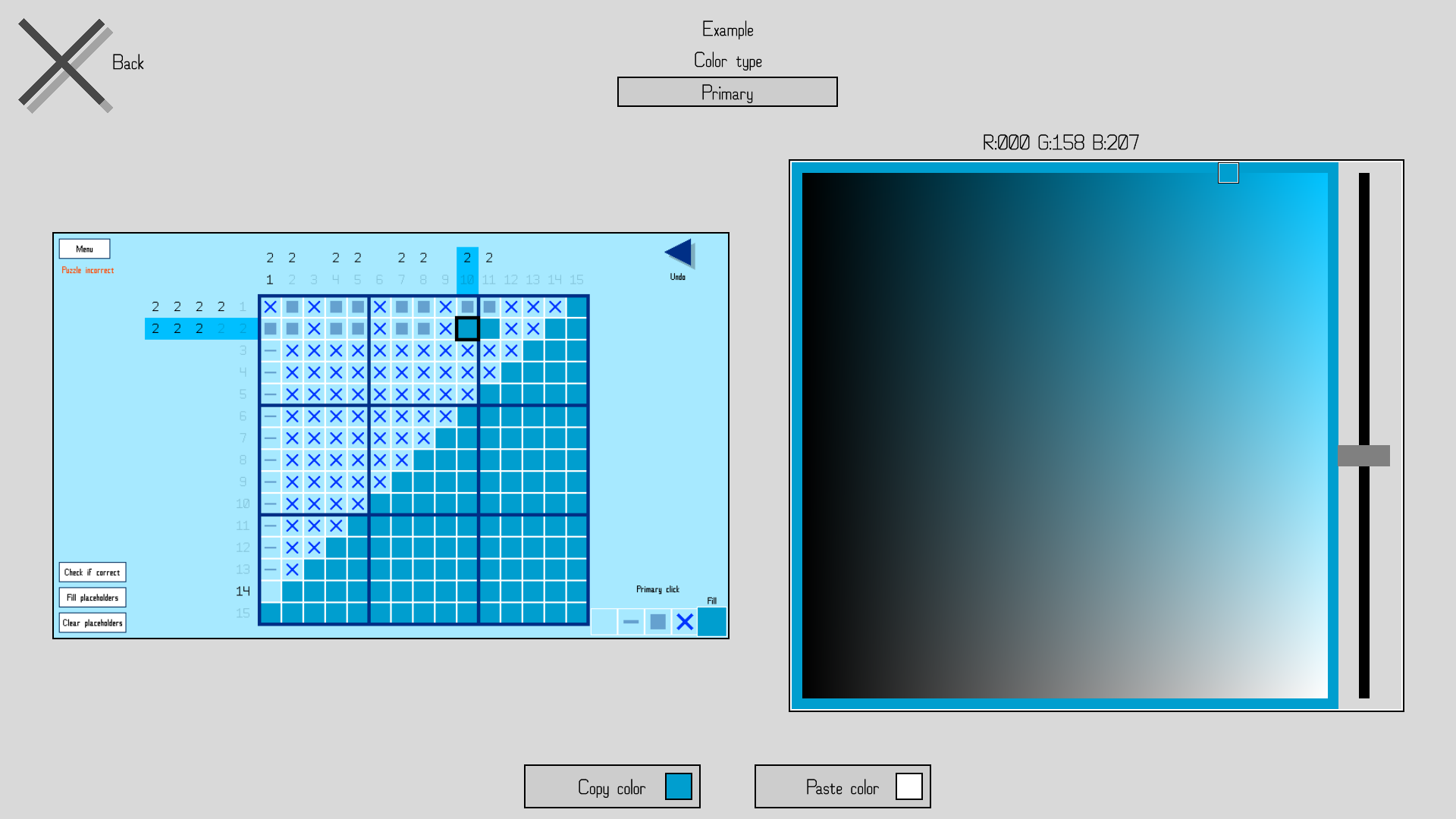
The color selector has been changed; instead of simply putting the red channel on the slider, the green channel on the x axis, and the blue channel on the y axis, the selector is now based on hue (slider), saturation (y axis), and value (x axis). This change makes finding and picking colors much more intuitive. Additionally, the granularity has been greatly increased, with 256 units along the x and y axis instead of 25, and 360 units along the hue slider, giving much more precise control over the colors you can pick. Because of this, directional movement with gamepad or keyboard on the color picker now has acceleration added to it.
The ability to copy and paste colors remains as before, including the ability to do so between themes.
Sharing themes
Custom themes can be exported and shared by directly sending the theme file (.THM) to someone else, who can then drop the theme into their Documents/Nonozle User Themes folder to have access to the theme in-game. Despite originally planning on it, I decided not to include Workshop theme sharing. I don't think the game's Workshop sees enough use for the extra effort to be worth it. But I'm willing to consider changing my mind if, like, more than one person requests it in the Steam forum. No promises though.
New color types, new color assignments
Several new color types have been added, and the colors of several elements in the game have been reassigned to different color types. The list of color types has also been reordered. Click below to learn more.
New color types
- "Button and credits background", which buttons and the credits screen now use as their background color instead of just using the "Background" type
- "Dots" color type, which page dots now use instead of the "Text" type they used before
- "Hint highlight" color type, which hint highlights now use instead of simply using the primary color with a lower opacity
- Removed "Hint highlight opacity" as an option and concept in themes
- Removed "Hint highlight opacity" as an option and concept in themes
- "Puzzle select button background" color type, which puzzle select buttons now use instead of using a variant of the primary color
- As a result, puzzle select buttons now no longer change color slightly when selected
- As a result, puzzle select buttons now no longer change color slightly when selected
- Added "Selected square border" color type, which the selected square in a puzzle is now outlined with when the "Outline/border color" option under "Puzzle appearance" is set to "Themed"
Renamed color types
- Dropped "color" from the end of all color types
- "Main color" to "Primary"
- "Faded text color" to "Faded hint" to reflect its new singular purpose
- "Highlighted hint fade color" to "Faded hint (highlighted)"
- "Arrow and X button color" to "Arrow, X button, slider handle" to reflect its new use
- "Input color" to "Highlighted text" to reflect its varied uses
- "Five-line alt. color 1" to "Five-line alternate 1"
- "Five-line alt. color 2" to "Five-line alternate 2"
Color type reassignments
- The puzzle select button checkmark now uses "Primary" instead of "Puzzle title text"
- The slider UI element now uses "Border" for the bar and "Arrow, X button, slider handle" for the handle instead of using hard-coded grey colors that didn't change with the theme
- The outline around actionable row/column hints now uses "Text" instead of "Faded hint" for greater visibility
- The background color behind UI elements in the main menu now uses "Puzzle grid background" instead of "Background"
- "A game by HopefulToad" and the version number text now use the primary color instead of "Text"
- The icon box on the title screen now uses "Puzzle grid" instead of "Border", which is how it should have been in the first place
- The toggle square on toggle buttons now uses "Text" instead of "Primary" for maximum visibility regardless of the theme ("Text" will always be highly visible against "Button background" in a usable theme, but "Primary" might not be)
- Additionally, the toggle no longer specifically changes color when it's disabled (other than the overall fade applied to the entire button)
- Additionally, the toggle no longer specifically changes color when it's disabled (other than the overall fade applied to the entire button)
- Checkmarks and signatures in the puzzle pack select screen and URLs in the credits now use "Highlighted text" (previously "Input") instead of the primary color to ensure visibility
- Disabled buttons now fade using a partially transparent "Background" rectangle overlaid over them rather than using "Faded hint"
- Percentage bar colors and appearance have been reworked; see "Other miscellaneous changes" below
New UI element: DropList
I created a new UI element specifically for the new theme editor: the DropList. Like the MultiOptionSelector (button with arrows on either side), its purpose is to pick one particular option among several. But instead of having to scroll through the options one at a time without being able to see them all at once, the DropList does exactly what it sounds like. When you click it, a drop-down (or up) list appears showing all the options at once, and you can then pick one.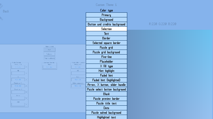
Many of the options that used to be contained within MultiOptionSelectors are now in DropLists.
Square overwrite behavior
Border/outline color
Window mode
Horizontal resolution
Vertical resolution
Font
Filling animation
Removing animation
Puzzle solved animation
Title/menu track
The ones that have been left as MultiOptionSelectors are either because there's only two options for the setting or because the options are sequential in nature.
Puzzle layout changes
I reworked puzzle grid sizing and placement. Again. This should be the last time, though. The method of determining how to best fill up the screen space with the grid has been improved and greatly simplified. Specifics are somewhat out of scope for these patch notes, but if you're curious, drop a thread on the forum asking about it and I'll do my best to explain.
The "Puzzle incorrect" warning label's location has been moved to directly below the "Menu" button instead of directly below the puzzle grid, freeing up more vertical space for the puzzle.
A new setting has been added that changes the placement of the puzzle grid on the screen. The setting can be found at Settings > Puzzle > Puzzle appearance > Puzzle centering style. There are three options.
The first, Grid, tries to place the puzzle grid itself as much in the center of the screen as it can, ignoring hints except to the extent that it won't allow the hints to be offscreen or overlap other elements.
The second, Hints and grid, considers both hints and the grid as one whole to be centered as much as possible. Imagine a rectangle drawn around and encompassing all the hints plus the grid. This rectangle is what is centered (as much as it can be). This is the type of centering the game did prior to adding options.
The third, Golden mean, places the grid at a point exactly between the two other options as a sort of compromise. I've found that, to my eye, this one looks the best, and it is the default now.
The puzzle editor grid's positioning and placement has similarly been simplified and improved. It is now always centered horizontally, whereas before this update it could sometimes be horizontally off-center at some aspect ratios or resolutions. The above-mentioned option doesn't affect it as there are no hints to display in the editor.
Bug fixes
- Fixed rumble bugs
- Fixed UI-movement type rumble occurring in puzzle pack selection, pack editor, and virtual keyboard screens even when it was toggled off.
- Removed an extra rumble on puzzle restart that shouldn't have been there
- Added back in the big rumble on puzzle solve which was mistakenly missing
- Fixed UI-movement type rumble occurring in puzzle pack selection, pack editor, and virtual keyboard screens even when it was toggled off.
- Fixed a minor visual bug with the fade animation in tutorial puzzles that became more noticeable when I was trying out new themes.
- Fixed a bug where the puzzle title shown in the solved puzzle screen would not update when the puzzle was renamed (until the game was restarted)
- Fixed bugs where UI reconstruction and primary color changes were not propagating to exported (other user) puzzle packs that weren't currently loaded into the reusable puzzle select scenario
- Fixed a bug with the puzzle solved animation that was only visible when the background and puzzle grid background colors were different
- Fixed font index and scaling settings not changing when all settings are reset to their defaults
- Fixed a bug where having empty inputs in multiple control categories (universal controls + one or more others) would be considered a conflict due to empty being considered the same input as empty
- Fixed an issue where elements of the puzzle solved screen would pop into view instead of fading into view when the puzzle solved ripple was disabled
- Fixed a resolution change being triggered twice on startup when it didn't need to be
- Fixed tutorial puzzle hint highlights being drawn over the puzzle grid instead of behind it
During initial load, the game occasionally gets stuck waiting for a Workshop query to finish that never does. There's not much I can do about that on my end, unfortunately. However, this update adds code to time out the query if it takes too long; that way the game can finish loading instead of being stuck. But when that happens, some of the Workshop items will have failed to load, so the game shows a notification warning you about happened and recommending you restart the game to properly load the Workshop items.
Other miscellaneous changes
- "Extra 2," another puzzle track disabled by default, has been added into the game. It was a track I composed at the same time as the others but didn't initially include with the game.
- The game now remembers the most recent puzzle you had selected within a puzzle select scenario in-between sessions. For instance, if puzzle B-45 was the last selected puzzle in the original puzzle pack at the time you close the game, when you start the game again and go to the original puzzle pack, it will start with that puzzle selected still. The only exception to this is with puzzle packs by other users due to their dynamic nature. They will instead automatically navigate to the earliest as-yet-unsolved puzzle.
- The UI of the puzzle validation screen has been simplified. Instead of two separate buttons ("Skip solve animation" and "OK") where only one would be enabled at a time, there's now just one button that changes its text and function as needed—it starts as "Skip solve animation" and changes to "OK" once you click it or once the animation has played out. Also, the back input now skips the solve animation and exits the validation screen, allowing you to intuitively mash either the select button or the back button when you're impatiently repeatedly tweaking a puzzle trying to get it to be solvable.
- A certain puzzle in the original puzzle pack has been renamed to "Ice Pops" because the prior name is actually trademarked and I'm scrupulous.
- Once the DLC comes out, "Ice Pops" will have the honor of being the only puzzle title to be used twice among any of the puzzles I've published, though the two puzzles are not identical.
- Once the DLC comes out, "Ice Pops" will have the honor of being the only puzzle title to be used twice among any of the puzzles I've published, though the two puzzles are not identical.
- Because the puzzle grid can now be closer to the bottom and right edges of the window/screen than before, it transpired that in certain cases the counting label would be partially off-screen. To rectify this, the counting label is now moved to the left side of the selected square when at the right edge of the puzzle and moved to the top side of the selected square when at the bottom of the puzzle.
- As mentioned under "New color types, new color assignments" above, a new option has been added to the "Border/outlined color" setting: "Themed." With this option, the selected square (and optional row/column outlines) will use the "Selected square border" color from the current theme. The other five options for that setting still do what they did before, but "Themed" is the new default and recommended option.
- The percentage bars representing music and sound effects volume and gamepad rumble intensity have been reworked visually. Previously, with the button inflation animation disabled, it was impossible to tell they were the currently selected button when full. To fix this, a buffer was added that surrounds the bar, so you can see the color of that buffer change when the button is selected versus when it's not. Mouse input involving the bar has thus been modified to account for the buffer. Additionally, the bar itself is now uses the "Selection" color type rather than a partially transparent "Primary." This addresses visibility issues with some of the new themes that weren't apparent with the original three built-in themes.
- All MultiOptionSelectors that contain only two options have been made non-wrapping for consistency. In fact, there are no longer any MultiOptionSelectors that wrap, because the only ones that used to wrap were two-option ones.
- All references to "visual theme" have been changed to "color theme" instead.
- Tutorial select buttons now ignore the puzzle transparency and solved puzzle border settings, displaying with the former and without the latter no matter what. It didn't really make sense to apply those settings to them in the first place.
- The default puzzle solved animation option has been changed to "Shuffle."
- The hint highlight on single-row tutorial puzzle examples has been removed as there's not much point in highlighting which row is being modified when there's only one row.
- The opacity of tutorial puzzle row/column highlights has been increased.
- The "Only aggregate ones" option is now disabled when hint aggregation itself is disabled.
- The positions of the music and sound effects volume bars have been swapped.
- The slider handle size is no longer determined by the number of units the slider has. Also, how the position of the slider handle is determined, including when using the mouse, has been modified.
- The number of disparate progress sections in the game's initial loading screen has been reduced to ten.
DLC puzzles out soon!
I had 100 new puzzles I was planning to release in a DLC pack to coincide with this update. Unfortunately, it didn't occur to me that the DLC page would have to be reviewed by Valve before it could be made public, so it'll have to wait a bit.
*Admittedly, I haven't tested how well the game handles having a thousand themes, but why would you want that many anyway?
Files
Get Nonozle
Nonozle
A number logic puzzle game.
| Status | Released |
| Author | HopefulToad |
| Genre | Puzzle |
| Tags | 2D, Family Friendly, Minimalist, Pixel Art, Relaxing, Singleplayer |
| Languages | English |
| Accessibility | Color-blind friendly, Configurable controls, High-contrast |
More posts
- 3.02.03 patch notesApr 07, 2025
- 4.01.25 patch notesApr 01, 2025
- 3.02.02 patch notesMar 19, 2025
- 3.02.01 patch notesOct 28, 2024
- Minor update (no version number change)Oct 28, 2024
- 3.01.00 - Counting passesDec 15, 2023
- 3.00.02 patch notesNov 29, 2023
- 3.00.01 patch notesNov 21, 2023
- Update 3.00.00 - Puzzle exporting and moreNov 21, 2023
Leave a comment
Log in with itch.io to leave a comment.